The Comfort of Color: Why We Crave Warm Tones in Fall
We can all feel when summer has run its course. The air turns crisp, the leaves shift from green to gold, and our minds turn to warm lattes and cozy firesides. We trade sleeveless sundresses and bright colors for boots and sweaters in richer, earthier tones. Yes, fall is in the air.
But have you ever wondered why the colors of fall feel so comforting? It’s not just sweater weather talking. We’re naturally drawn to warm hues because of the psychology of warmth.
The Psychology of Warmth
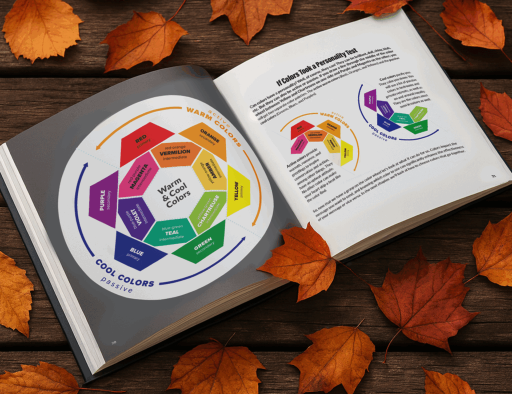
Warm tones like reds, oranges, yellows, and browns activate feelings of comfort, stability, and nostalgia. In Part 3 of my book, Everything You Never Wanted to Know About Color, I explore how colors influence our emotions. In Part 1, I discuss color temperature—the idea that one side of the color wheel (reds, oranges, yellows) radiates warmth, while the other (blues, greens, purples) cools things down.
How the Season Shapes Our Perception
It’s not only temperature that influences how we experience color. As the days grow shorter and sunlight softens, our visual appetite changes. Nature’s palette deepens, and we instinctively follow suit—mirroring the season through the colors we wear, decorate with, and even eat.
Autumn’s arrival brings its own sensory palette: golden leaves, pumpkin pie, cranberry sauce, and cinnamon-spiced everything. These flavors and visuals connect us emotionally to the season’s warmth and familiarity.
Designers Know: Warm Colors Sell Comfort
Designers and brand strategists tap into this instinctive pull. Fall campaigns often feature cozy, warm tones to evoke nostalgia and belonging—even when those hues aren’t part of a brand’s year-round palette. Some companies create dedicated seasonal color toolkits that complement their core branding.
Take Starbucks, for example. Each year, its fall visuals wrap around the famous Pumpkin Spice Latte, using oranges, yellows, and earthy browns that immediately signal “cozy season.” The palette feels familiar yet fresh, like coming home to something you didn’t realize you missed.
Color Is More Than Visual
Color isn’t just an aesthetic choice; it’s emotional. It can spark memories, shape moods, and even define traditions.
And speaking of color traditions, have you ever wondered why red and green rule the holidays? We’ll unwrap that next month.
Grateful for Color Conversations
As Thanksgiving approaches, I’m thankful for every opportunity to talk about color and help others feel more confident using it. If you have questions about color—how it works, how to use it, or how to make it speak for your brand—I’d love to hear from you.