Fall into Color
The Comfort of Color: Why We Crave Warm Tones in Fall We can all feel when summer has run its ...

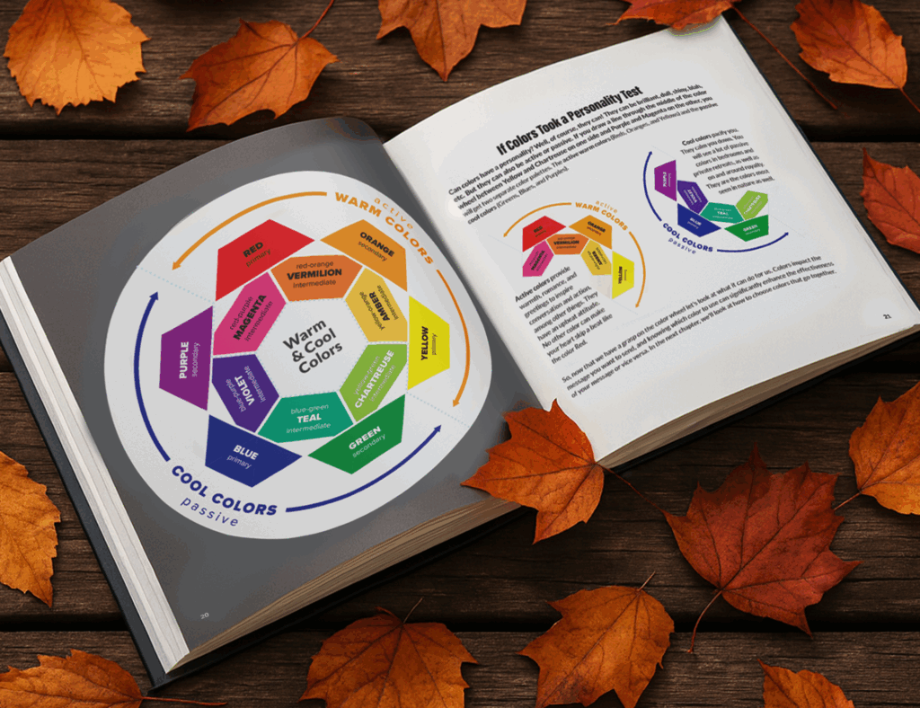
Dissecting the Color Wheel
The first step in understanding color theory is understanding the color wheel. You remember the color wheel from elementary school ...

Why “Dot Dot Color”
I’m writing a book that I had hoped would be out by this summer… maybe it still will. I’ve had ...